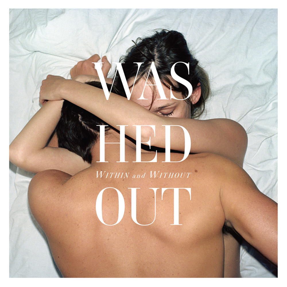
Washed Out Covers Chris Isaak’s ‘Wicked Game’

Recently Washed Out performed for Sirius XMU Sessions, during which they performed a short but well-realized cover of Chris Isaak’s lovely 1989 slow jam ballad “Wicked Game,” from his record Heart Shaped World. It’s a great reminder to how amazing the original is.

Check out Isaak’s performance on Late Night with David Letterman (back when he was on NBC) from March 1991. Excellent version.

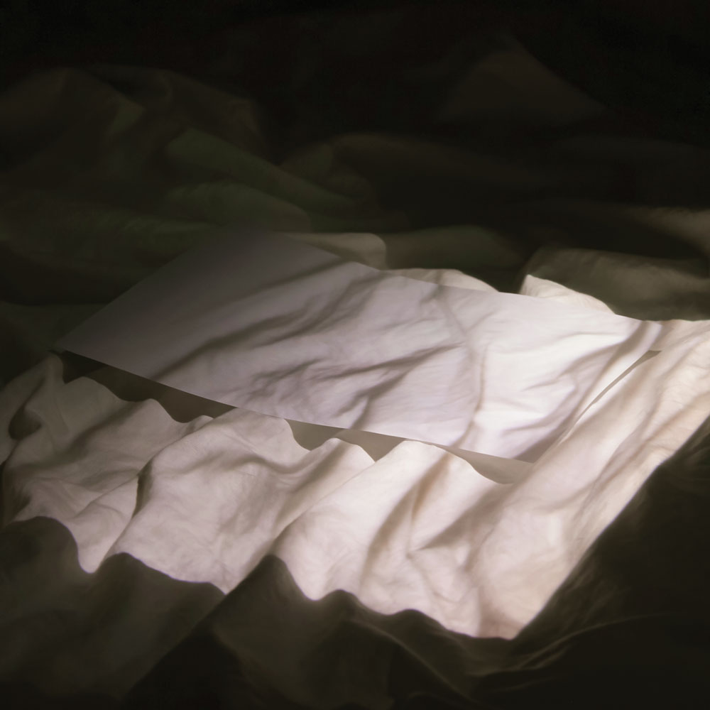
New Record Cover Art Trend? Bed Sheets Are The New Polaroid

Seemed like for awhile every indie band would use a seemingly low fi cover made from a Polaroid or retro-looking candid photograph as their album cover art. Pitchfork even looked at this trend not too long ago.

Now, I’m starting to see a new trend develop. Photos of beds, sheets, pillows and people ON said beds.

Here are three recent ones I’ve found, but I’m sure there are way more if I dug a little deeper.

Houses, All Night

Washed Out, Within And Without

Holy Other, With U

So what other albums are employing this? I’m told that according to the New York Times, three makes a trend. So what is the origin? Excluding general laziness or lack of creativity when it comes to album art, because that would be too easy to blame, why is this now a “thing?” Is it group think? Copy cats? Coincidence? YOU DECIDE!

UPDATE 6/18/2012: Recently I found yet another album cover that can be added to this trend of album art to employ bed sheets and pillows and scantily clad bodies. Here’s Violens’ True.

UPDATE 8/30/2012: Holy Other has another bed sheets-inspired cover for their album Held.

UPDATE 4/29/2014: Found yet another bedsheets album cover, this time for the new EP from Tourist, Patterns. Behold:

UPDATE 8/1/2014: The upcoming album from shoegaze metal band Whirr, Sway, has sheets too.

Comparing The National’s Album Art Design

Before he was the the brooding baritone singer of The National, Matt Berninger used to be a graphic designer (albeit one who reportedly distracted himself by scribbling lyrics in the margins during meetings). So it sorta makes sense that he and the band would have a great, clean sense of design when it comes to their record covers. Starting with last year’s very fine High Violet, and continuing through their subsequent singles and EPs, The National’s album art has been particularly gorgeous, with a cohesive, evocative look and feel.

These covers are the work of New York-based artist Mark Fox, whose sculptures have been the basis for, and in some cases, re-purposed into album art. These incredibly intricate sketches and sculptures look to be crafted out of all sorts of textures and tactile materials: wood, string, metal, tape, paper colored with paint and colored pencils, and so on. There is so much detail to these pieces that you want to reach out and touch them, but at the same time there is a simplicity to Fox’s work which allows them to be a natural fit for an album cover.

When viewed together into a series, and coupled with a sleek typography layout, there’s a clear sense of style and direction that seems perfect for the dark, melodic vibe that The National’s music exudes.

Fox’s piece “The Binding Force” was used as the basis for the cover for The National’s full-length album High Violet:

The cover to the lead single “Blood Buzz Ohio,” is based on Fox’s piece, “Jane Jacobs Understands The Beehive:”

The cover to “Terrible Love” single and the expanded edition of High Violet uses Fox’s piece, “Ark:”

The cover to the single “Think You Can Wait,” is based on Fox’s “Cloud (Days Of That Are Over):

And finally, the cover to the brand new single “Exile Vilify” is based on “The White Sawhorseman:”

You can also apparently buy t-shirts from The National, designed by Mark Fox too (Here and here.) Great stuff.

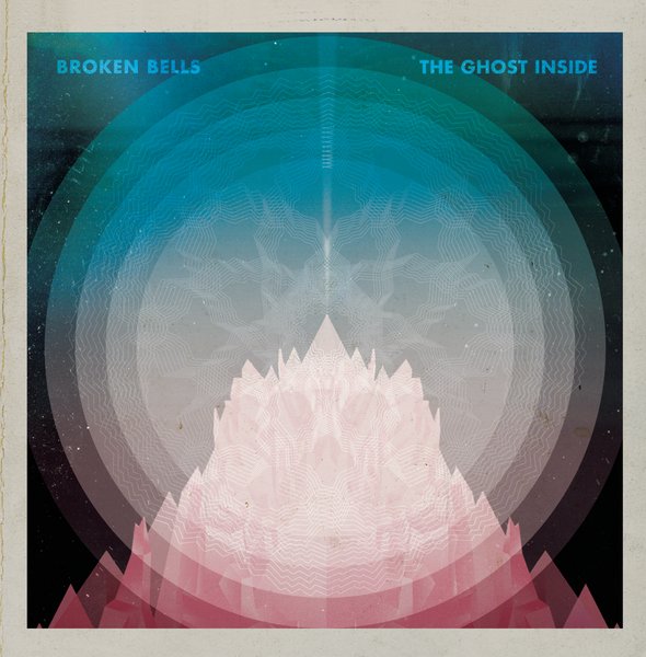
Admiring The Art Design Of Broken Bells

Last year’s album from Broken Bells — a collaboration between Danger Mouse (aka Brian Burton) and The Shins’ James Mercer — was among my favorite records of the year. It was such a great mix of psychedelic pop instrumentation, Spaghetti Western soundtracks and electronic experimentation, but done in a way that was still very approachable. The record was definitely a grower though, as it took time to listen and dig in to all the layers going on under Mercer’s voice.

One of the other things I have loved about Broken Bells is the visual aesthetic of their record cover art. The cover art for the band’s full-length debut — as well as for the singles “The High Road” and “The Ghost Inside” — was designed by Atlanta-based artist Jacob Escobedo, who has also done work for Gnarls Barkley and the Dark Night of the Soul album.

All the images have a cohesive design and color palette, clean typography and a worn-in feel that makes each cover look like an old waterlogged record discovered in a forgotten bin down in the basement. As I said in my round up of the best album art of 2010, “the imagery is both cosmically alien and antiquated, as if it’s what we imagined the future to look like in 1973.”

The band just announced a new EP, Meyrin Fields, that continues this trend and works just beautifully. You can hear a track from the EP over on the All Songs Considered blog at NPR Music.

Swipe File: Sweet Apple Covers Roxy Music Cover

This one is pretty obvious. But still fun to see someone do an homage to Roxy Music’s iconic, and at one time controversial album cover. Plus, let’s keep it shallow here and acknowledge that any over with attractive women is sure to get at least some attention.

Here’s the cover to Love and Desperation, the new album from J. Mascis (obviously of Dinosaur Jr.) side project Sweet Apple:

And here’s the original from Roxy Music’s Country Life:

Swipe File: Ventriloquist Edition

Just read a review in Pitchfork of garage rock outfit, Turbo Fruits, a side project of sorts from the folks of the late Be Your Own Pet.

But really, I clicked on the link because of the rather familiar album art. Surely I’m not the first person to point this out the similarities with these two covers right?

Cover to Turbo Fruits‘ new album, Echo Kid:

Cover to Blood Sweat and Tears’ 1968 album Child Is The Father To The Man:

Old Things That Are New To Me: Melody

File this one under “This seems like something I should have known… but didn’t.”

This morning I was listening to the wonderful Seattle radio station KEXP online and heard a moody, grooving song by David Holmes called “Don’t Die Just Yet.”

(Holmes, you might know from being the musician, producer and DJ behind many film soundtracks including notably, Steven Soderbergh’s Out Of Sight and Ocean’s Eleven.)

As I was listening, I heard these amazing swelling strings and dueling distorted guitar solos that I noted out loud sounded exactly like Beck’s fantastic “Paper Tiger” from Sea Change, one of my favorite albums by Beck.

It was promptly pointed out that this Holmes remix incorporated bits of strings from Serge Gainsbourg’s song “Melody” and that it was a song that Beck and Sea Change producer Nigel Godrich had apparently openly aped for their own song.

[youtube]http://www.youtube.com/watch?v=2VoJMUpzAyI[/youtube]

I have been only somewhat aware of Serge Gainsbourg’s work on a very general level — I can recognize his musical style when I hear it, and have always enjoyed most of what I’ve heard. But I’ve never owned any albums by him so, up until now, I’ve never been overly familiar. But considering my fondness for Beck’s music, I was naturally a tad shocked that this song had eluded me.

I always love when hearing some random song takes you down this rabbit hole that presents an opportunity to discover new music and to dig into the Gainsbourg-sized gap in my musical knowledge.

“Melody” of course comes from the 1971 concept album, Histoire de Melody Nelson, in which Gainsbourg sleazily sings of a pseudo-autobiographical tale involving a car crash with the aforementioned Melody Nelson, a Lolita-esque teenage nymphet that he eventually seduces.

Histoire de Melody Nelson‘s mixes abrupt guitar, funky bass grooves and Gainsbourg’s distinctly lecherous spoken word vocal delivery all flourished with lush string and choral arrangements by Jean-Claude Vannier who composed almost all the music on the record.

According to the Wikipedia article, the album has “proven to be highly influential amongst later francophone and anglophone musical performers” including the Air, Pulp’s Jarvis Cocker, Portishead, and Beck.

A music video was made for each song on the incredibly short 28-minute album and eventually packaged together as a musical. Check out the video below for “Melody:”

[youtube]http://www.youtube.com/watch?v=7fGXkT485ic[/youtube]

How did I miss this one? How did I miss that more than obvious connection between Beck’s song and Gainsbourg’s? The world will never know.

Best Song I’ve Heard All Day: Unlikely Cover Song Edition

(parts 792 in a 1001 part series)

Lately I feel like this has become some sappy Flaming Lips fan blog, but this one was too good to pass up, and what can I say? I am fan.

Anyone who knows me even a little knows that I love a great cover song. One that’s not only a great performance, but one that makes you hear the original in a new light. One of my favorites from this year so far is The Flaming Lips’ cover of Madonna’s “Borderline.”

I first heard The Lips play this song at that pretty mediocre Earth Day concert earlier this year and it was fun to hear, but much like the rest of the set, underwhelming.

What I didn’t know was that the band not only has incorporated the song into their live set, but recorded it for a Warner compilation, Covered, A Revolution in Sound: Warner Bros Records with members of Stardeath and White Dwarfs. But judging from the rest of the music included, “Borderline” looks to be the standout.

The Flaming Lips’ version starts as a mellower approach to the song, dreamy and full of computerized glitches and chiming tones. But soon that epic noise rock side of the band really explodes, transforming it into a fantastic shoegazey stadium anthem. What I love about it is that it truly reinvents the song, peeling away the sheen and gauzey production of Madonna’s original and finding the nugget of a great pop song. Like most Madonna songs, this one is fully of great melodic hooks and really makes you appreciate the songcraft with fresh ears.

Take a listen here, and watch the great video that they made for it:

Compare and Contrast: “The Elevation” vs. “Californication”

Surely the similarities here have been pointed out in the past. But it just struck me today how nearly identical the guitar parts and the general tone are in both of these songs. Interesting…

“The Elevation” by Television from Marquee Moon

[youtube]http://www.youtube.com/watch?v=fE7uXtXXFtM[/youtube]

“Californication” by Red Hot Chili Peppers from Californication

[youtube]http://www.youtube.com/watch?v=1yoTBeDIi64[/youtube]

Compare and Contrast: Vanderslice’s ‘Too Much Time’

I’ve already gushed about John Vanderslice‘s fantastic new album Romanian Names a few days back, (I’m also in the midst of writing a piece for NPR Music about Vanderslice, so stay tuned for that). But I came across a few videos on YouTube that really show off one of my favorite songs off the record, “Too Much Time.”

On the album, the song takes on a much darker tone, a bit of a mix of electronic and new wave perhaps; almost Cure-like.

But as you can hear in these various versions below, Vanderslice has obviously toyed around with the arrangements for the different live settings. I always find it interesting to hear how a song progresses from its beginnings to how the production ends up on the final album. Take a listen:

Striped down, acoustic version for KEXP

A less striped down version with violin:

[youtube]http://www.youtube.com/watch?v=Z1r1RAzjV9U[/youtube]

A fuller version with The Magik*Magik Orchestra:

[vimeo]http://vimeo.com/3073010[/vimeo]